|
Skill level: Advanced One of the more exciting features of Excel, is its ability to create interactive charts - charts that change instantly as you change the criteria. Not only is it very impressive and makes you look like an expert, it is actually very easy to set up. Just to give you an idea what an interactive chart would look like, see the chart below. By selecting the relevant department, the chart changes to show only the turnover data for the selected department. 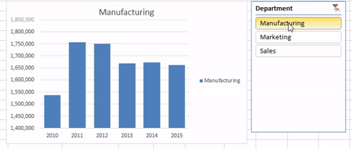 (Don't pay too much attention to the figures, it might not make a lot of sense - I just used random data to generate the chart). So here’s how to create an interactive pivot chart with the use of a slicer. I have put together a simple data table with 3 columns for Date, Turnover and Department. There are 3 departments and the turnover data stretches over 6 years. 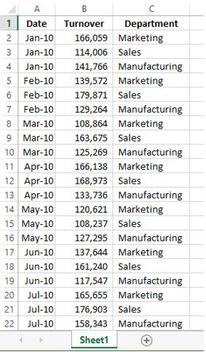 Highlight all of the data (Shortcut: Cntrl A while any one of the cells in your data range is selected – this selects the entire data field automatically), and insert Pivot table. In this example, I am going to insert the pivot chart on the existing worksheet in Cell E1 – just to have everything on one page. You can insert on a new worksheet if you prefer. Press Okay. 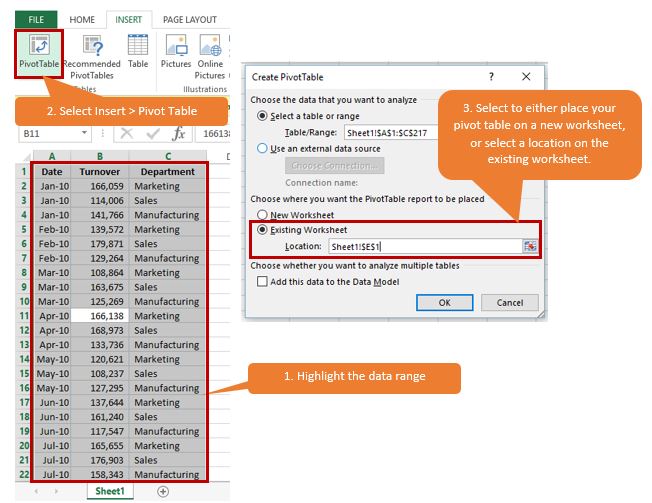 Start by dragging Date into the Rows field, Turnover into the Values field, and Department into the Columns Field. 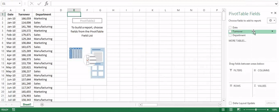 Group the dates into years by selecting any one of the dates, then select Group Selection in the Analyze tab under Pivot Table tools. Deselect Months, and choose years instead. Click okay. 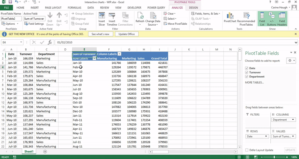 Get rid of the grand totals for now, we don’t need it for this example. Right click and select “Remove Grand Total” in both the last column and the last row. 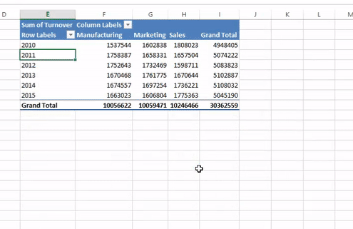 Change the number formatting so that the figures are easier to read. To change the formatting of all 3 columns at the same time, simply highlight one cell in each column, right click and select Value Field Settings. Select Number format in the bottom left corner. Select number, tick the box to “Use 1000 Separator (,)”. Reduce decimal places to 0. Click Okay, and Okay again. 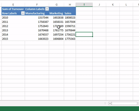 Your data is now ready for a pivot chart. While you have any cell selected in your pivot table, select the Pivot Chart option in the ribbon under Pivot table Tools > Analyze > Tools group. I have selected the first suggested chart, which is a normal Colum Chart. 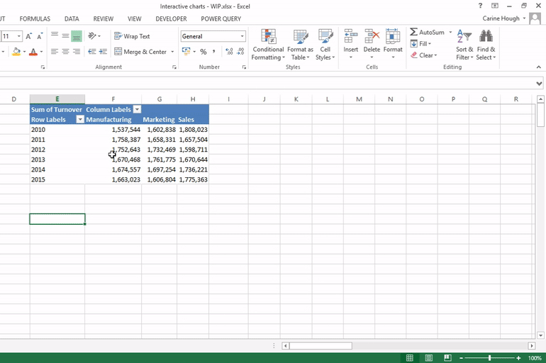 The field buttons (that appear as grey buttons) on the chart act as filters, the same way that you can filter data in you pivot table. You can go ahead and test it to see how they work. If you click on date, you can change the dates for which the data is shown. The same applies for department. I personally do not like the Field Buttons on a Pivot Chart. Slicers replace their function anyway, and is easier to use. So I usually just get rid of them by right clicking on any one of them, and select “Hide all Field Buttons on Chart”. The chart looks a lot cleaner and prettier without them. 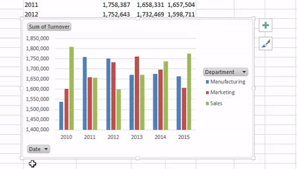 I also prefer the bars to be wider. This is just a personal preference, you can decide what you want your chart to look like. Right click on any one of them, select Format Data Series and change the gap width. I usually change it to 50%. As you increase the gap width, the space between the bars increases while the bars become thinner. The higher the percentage, the wider the gap and the thinner the bars, and vice versa. 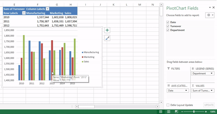 To insert a slicer, make sure either your pivot chart or pivot table is selected. Select the Insert tab in the ribbon, and select slicer. All of the fields in your pivot table will be available for selection. You can select any one of the fields to create a slicer. This would function as a filter and controls both the pivot chart and the pivot table. For this example, I am only creating a slicer for the Department field. 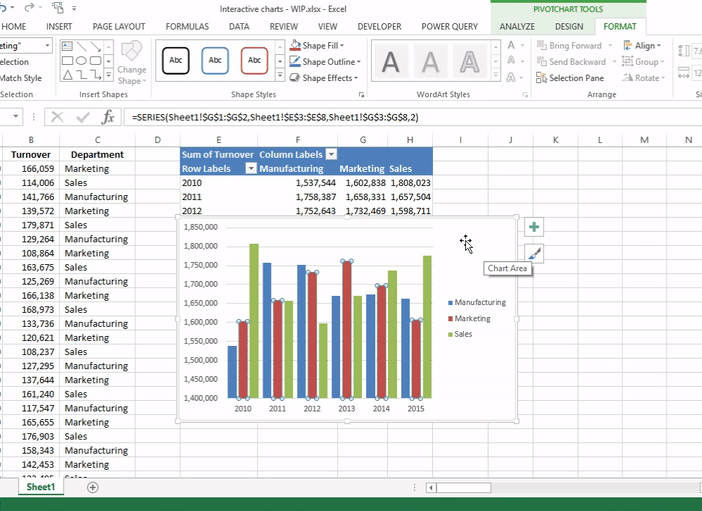 You are now able to select any one of the departments. The data illustrated in the chart changes depending on the slicer value that you select. You can select one at a time or 2 or 3 at the same time to compare the figures. To select multiple departments, either click and drag over the buttons that you which to select. Alternatively, hold your Control key in while you select the departments that you wish to view. Notice how the pivot table above the chart also changes as you change the filter. 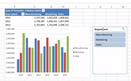 And there you have it. An interactive chart in just a few easy steps.
2 Comments
Marlene Van Burick
7/9/2016 10:22:57
This is fantastic. 20/12/2022 13:52:34
Thanks for sharing this wonderful information! So long, spreadsheets. Thanks to AI tech, ANNA scans your receipt, stores the details and assigns an expense category, without you having to type a thing. Leave a Reply. |
Carine HoughHi, and welcome to my blog :) I am an Excel enthusiast and want to help others keen on improving their own Excel skills. I hope you learn something useful on my blog. 
Categories
All
|
