|
Skills level: Advanced
With a simple data set, you can extract quite a lot of useful information with the click of a few buttons within a pivot table. In an excel sheet, Mark, the financial manager of a hardware store, has a list of sales invoices for the past 3 months. The list contains only the invoice number, the invoice amount and the sales person who performed the transaction. At first, it seems like he has very limited data to work with, but you will be surprised by what he is able to extract from this data using pivot tables. And it can be done in minutes, if not seconds! He needs to report to his seniors and give a more detailed analysis of what is happening in his store. A few questions he needs answered are the following:
2 Comments
Skill level: Advanced One of the more exciting features of Excel, is its ability to create interactive charts - charts that change instantly as you change the criteria. Not only is it very impressive and makes you look like an expert, it is actually very easy to set up. Just to give you an idea what an interactive chart would look like, see the chart below. By selecting the relevant department, the chart changes to show only the turnover data for the selected department. 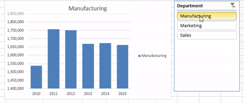 (Don't pay too much attention to the figures, it might not make a lot of sense - I just used random data to generate the chart).
So here’s how to create an interactive pivot chart with the use of a slicer. I have put together a simple data table with 3 columns for Date, Turnover and Department. There are 3 departments and the turnover data stretches over 6 years. |
Carine HoughHi, and welcome to my blog :) I am an Excel enthusiast and want to help others keen on improving their own Excel skills. I hope you learn something useful on my blog. 
Categories
All
|
